


MASTERCLASS
Case Study:
Turning Static Sexual Education Content into Guided Learning
1. Context & Role

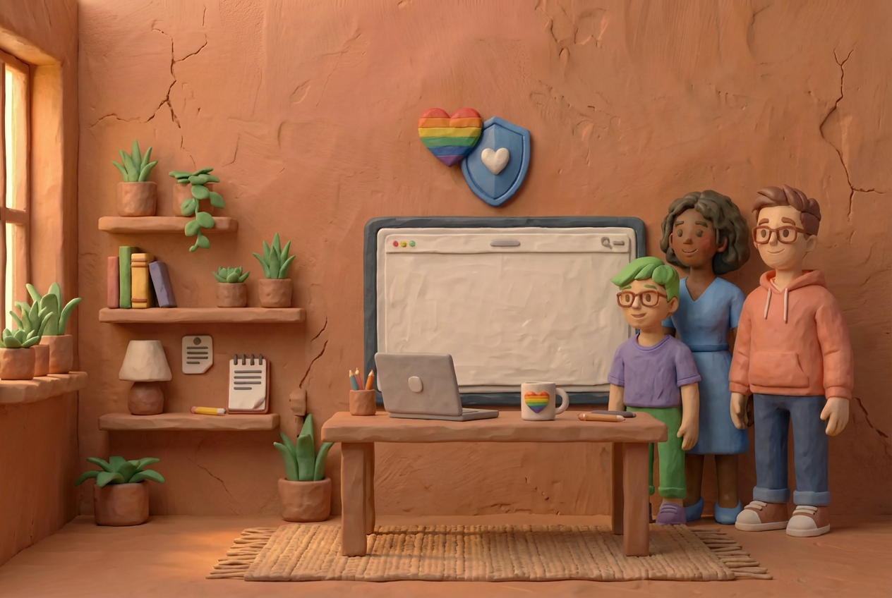
Project: Guided courses for a sexual education platform
Timeline: 8 weeks
Team: Project Manager, Content Strategist, Engineer, Product Designer (me)
My role: Owned design for the guided learning feature from problem framing through launch
The platform offers inclusive sexual education through articles, videos, and audio. A core audience includes queer and trans users who often lack access to safe, affirming sexual health resources.
2. The Problem
The platform had strong content, but it lived in a flat content library. Users could browse or search, but there was no structure to help them navigate sensitive or unfamiliar topics.
As a result:
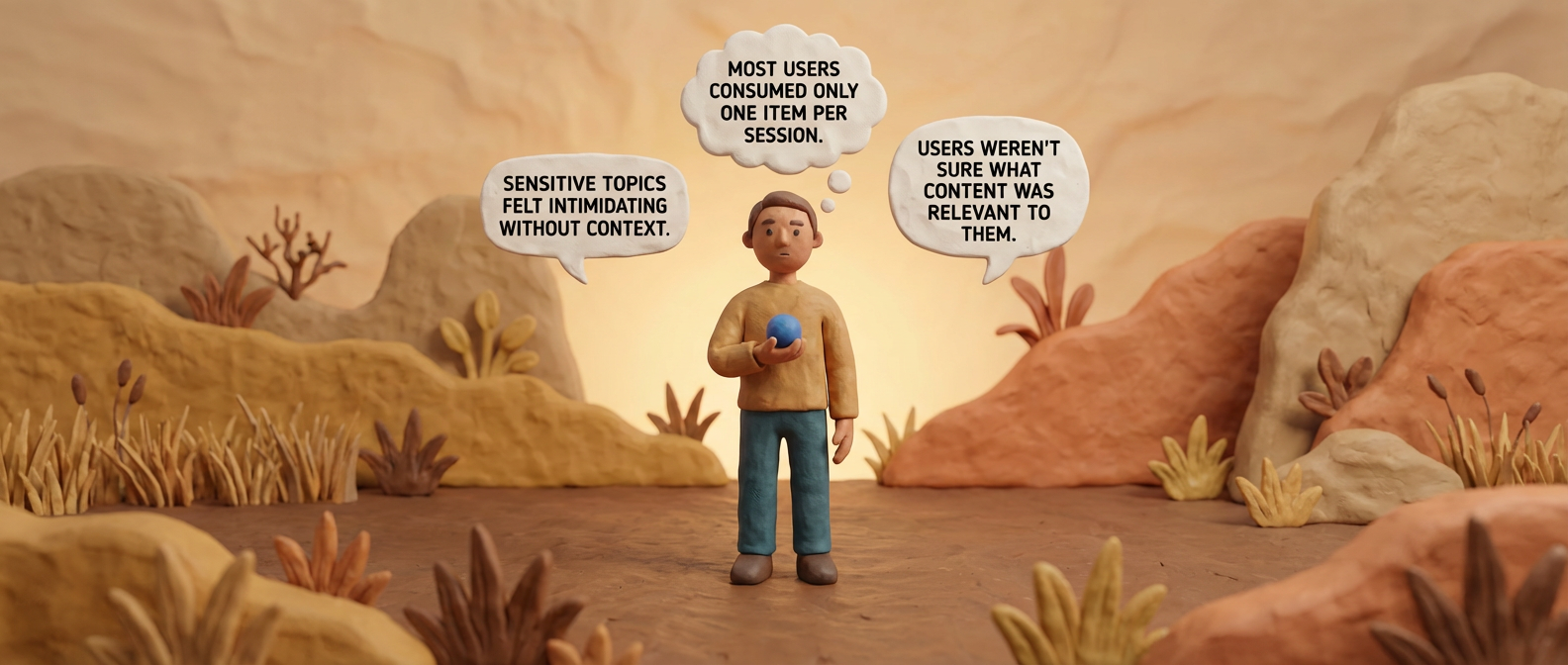
- Most users consumed only one item per session
- Sensitive topics felt intimidating without context
- Users weren’t sure what content was relevant to them
For a product dealing with taboo topics, this lack of guidance created unnecessary friction and drop-off.
Users had access to content, but no sense of where to begin, especially for sensitive topics.
3. Why We Focused on This
We saw clear signals that content discoverability and guidance were limiting engagement.
Key Signals
- 63% of sessions ended after a single content item
- Average session duration was under 3 minutes
- Queer- and trans-related topics had higher exit rates
I think the biggest issue I face is not knowing where to start. There’s so much content—articles, videos, quizzes—but it’s not clear what I should learn first. It’s overwhelming, and I end up feeling stuck because I’m afraid I’ll miss something important.

Anna J.
“
There’s a lot of information here, but I don’t always know what’s meant for someone like me. I end up clicking around and second-guessing myself. Especially with gender-related topics, I worry I’m starting in the wrong place.
Neeraj S.
“
I don’t always know why a topic is being introduced or what to expect. When there’s no context, it makes me hesitate or leave. Some pages feel intense the moment I open them. A little framing would make it feel safer to continue.
Nadia A.
“
This made it clear the problem wasn’t content volume, it was how users were being supported through it.
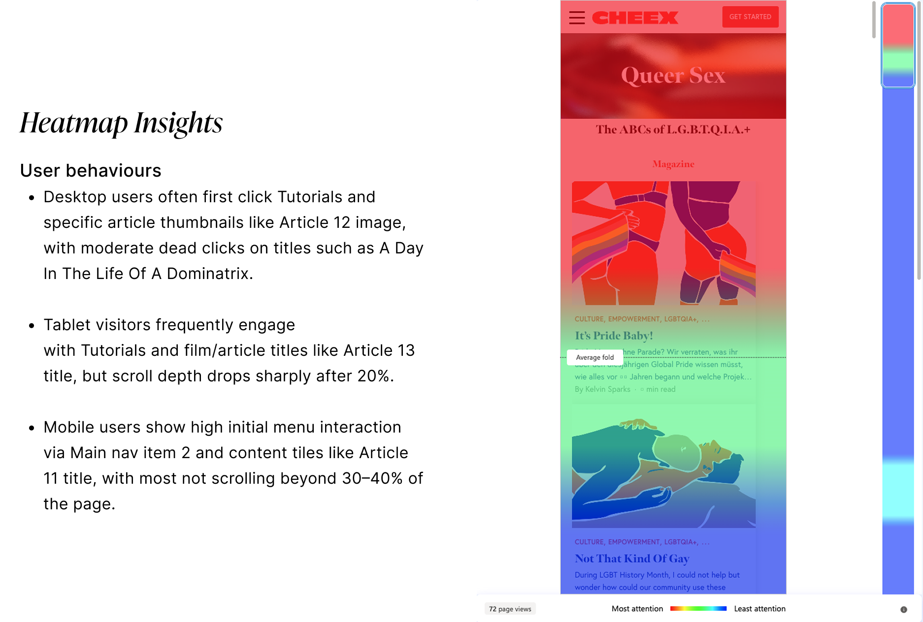
Along with qualitative insights we placed strong emphasis on insights derived from heatmaps.
Heatmaps allowed us to objectively visualize user behavior at scale: highlighting where users clicked, scrolled, paused, or dropped off.
By analyzing these interaction patterns, we were able to validate qualitative assumptions, uncover friction points that users did not explicitly articulate, and identify high-engagement areas that signaled intent or interest.
This combination of subjective user feedback and quantitative behavioral evidence helped us form a more balanced, data-driven understanding of user needs and usability issues, ultimately strengthening the confidence behind our design and product decisions.
4. Insights That Shaped the Direction
After reviewing user feedback, content structure, and internal discussions, three insights stood out:

Sexual education is emotional, not just informational
Users needed reassurance and framing before engaging.

Choice overload increased hesitation
Especially for taboo topics, users preferred being guided rather than browsing freely.
Inclusivity had to be explicit
Queer and trans users responded better when content clearly acknowledged diverse bodies and experiences.
5. Problem Definition & Success Criteria
Problem Statement

How might we guide users through sensitive sexual education topics in a way that feels supportive and inclusive, while still allowing flexibility and control?
What Success Looked Like
- Users engage with more than one piece of content
- Longer, more intentional sessions
- Reduced drop-off on sensitive topics
- Positive feedback around clarity and comfort
6. Solution: Short, Guided Courses
Instead of building new features or content, we reorganised existing materials into short, guided courses.
Each course:
- Grouped related articles, videos, and audio
- Set expectations up front with empathetic language
- Provided light structure without pressure to “complete”
- Let users move at their own pace
This approach allowed us to ship quickly while directly addressing user hesitation.
We reframed content as short courses to reduce hesitation and set expectations upfront.
7. Key Design Decisions
Why Courses (and Not Other Options)
- Playlists lacked context and progression
- Personalization was out of scope for the timeline
- Courses balanced clarity, guidance, and feasibility
Important Choices
- Courses were intentionally short to avoid overwhelm
- No quizzes, grades, or forced completion
- Language emphasized consent and agency (e.g. “Continue when you’re ready”)
We focused on reducing emotional friction rather than maximizing engagement metrics at all costs.
8. Final Experience
What Users See
- Clear course overview explaining who it’s for
- Explicit inclusivity statements (e.g. “Inclusive of all genders and bodies”)
- Simple progress indicator for orientation
- Flexible navigation between content pieces
Example Course Topics
- Understanding Your Body Beyond the Binary
- Navigating Consent in Queer Relationships
- Sexual Health for Trans and Gender-Diverse People
Each course framed why the content mattered before asking users to engage.
Progress indicators were designed for orientation, not motivation.
9. Working with Constraints
Collaboration
- Scoped the feature with the PM to fit an 8-week window
- Worked closely with engineering to reuse existing CMS structures
- Partnered with the content strategist to align on tone and language
Constraints
- No new content production
- Limited engineering bandwidth
- High accessibility and sensitivity requirements
These constraints pushed us toward a solution that focused on structure, language, and flow rather than new functionality.
10. Results
What Changed After LaunchQuantitative Evaluation

Session duration increased by 48%

Content items per session increased from 1.3 to 3.1
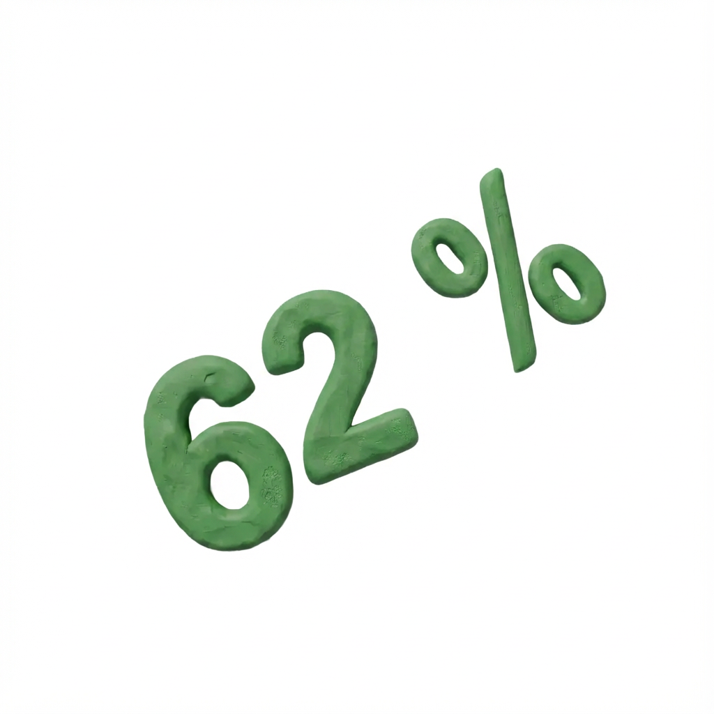
62% of users who started a course completed it
Qualitative Feedback
- Users reported feeling “guided” and “less overwhelmed”
- Queer and trans users mentioned feeling seen and supported
- Fewer support requests asking where to start
11. Takeaways
This project reinforced for me that good product design is as much about reducing emotional friction as it is about improving usability. In a space like sexual education, especially for queer and trans users, confusion, shame, or fear of being misunderstood can be just as blocking as a broken interface. Designing the right structure and language turned out to be as impactful as any visual or technical change.
What I learned
I learned that structure can act as a form of safety. By turning a flat content library into guided courses, we gave users a sense of orientation and support. Knowing what to expect, how long something would take, and that they could pause or stop at any time lowered the emotional cost of engaging with sensitive topics.
I also saw how clear framing changes behavior. Introducing each course and section with empathetic, inclusive context helped users feel more confident that the content was meant for them. This was especially important for queer and trans users, who often arrive with past experiences of being excluded or misunderstood.
Finally, this project showed me that meaningful product impact does not always require building new features. By reusing existing content and focusing on how it was presented, we were able to significantly improve engagement and completion. Thoughtful information architecture, microcopy, and flow design had a measurable effect on how supported users felt.
What I would do next
With more time, I would explore lightweight personalization, for example allowing users to select topics, comfort levels, or identity related preferences to shape how courses are recommended and framed.
I would also look at ways for users to safely return to what they have started, such as private bookmarks, gentle reminders, or a continue where you left off experience that respects the sensitive nature of the content. These additions could further support long term learning without increasing pressure or exposure.


MASTERCLASS
Case Study:
Turning Static Sexual Education Content into Guided Learning
1. Context & Role

Project: Guided courses for a sexual education platform
Timeline: 8 weeks
Team: Project Manager, Content Strategist, Engineer, Product Designer (me)
My role: Owned design for the guided learning feature from problem framing through launch
The platform offers inclusive sexual education through articles, videos, and audio. A core audience includes queer and trans users who often lack access to safe, affirming sexual health resources.
2. The Problem
The platform had strong content, but it lived in a flat content library. Users could browse or search, but there was no structure to help them navigate sensitive or unfamiliar topics.
As a result:
- Most users consumed only one item per session
- Sensitive topics felt intimidating without context
- Users weren’t sure what content was relevant to them
For a product dealing with taboo topics, this lack of guidance created unnecessary friction and drop-off.
Users had access to content, but no sense of where to begin, especially for sensitive topics.
3. Why We Focused on This
We saw clear signals that content discoverability and guidance were limiting engagement.
Key Signals
- 63% of sessions ended after a single content item
- Average session duration was under 3 minutes
- Queer- and trans-related topics had higher exit rates
I think the biggest issue I face is not knowing where to start. There’s so much content—articles, videos, quizzes—but it’s not clear what I should learn first. It’s overwhelming, and I end up feeling stuck because I’m afraid I’ll miss something important.
Anna J.
“
There’s a lot of information here, but I don’t always know what’s meant for someone like me. I end up clicking around and second-guessing myself. Especially with gender-related topics, I worry I’m starting in the wrong place.
Neeraj S.
“
I don’t always know why a topic is being introduced or what to expect. When there’s no context, it makes me hesitate or leave. Some pages feel intense the moment I open them. A little framing would make it feel safer to continue.
Nadia A.
“
This made it clear the problem wasn’t content volume, it was how users were being supported through it.
Along with qualitative insights we placed strong emphasis on insights derived from heatmaps.
Heatmaps allowed us to objectively visualize user behavior at scale: highlighting where users clicked, scrolled, paused, or dropped off.
By analyzing these interaction patterns, we were able to validate qualitative assumptions, uncover friction points that users did not explicitly articulate, and identify high-engagement areas that signaled intent or interest.
This combination of subjective user feedback and quantitative behavioral evidence helped us form a more balanced, data-driven understanding of user needs and usability issues, ultimately strengthening the confidence behind our design and product decisions.
4. Insights That Shaped the Direction
After reviewing user feedback, content structure, and internal discussions, three insights stood out:
Sexual education is emotional, not just informational
Users needed reassurance and framing before engaging.
Choice overload increased hesitation
Especially for taboo topics, users preferred being guided rather than browsing freely.
Inclusivity had to be explicit
Queer and trans users responded better when content clearly acknowledged diverse bodies and experiences.
5. Problem Definition & Success Criteria
Problem Statement
How might we guide users through sensitive sexual education topics in a way that feels supportive and inclusive, while still allowing flexibility and control?
What Success Looked Like
- Users engage with more than one piece of content
- Longer, more intentional sessions
- Reduced drop-off on sensitive topics
- Positive feedback around clarity and comfort
6. Solution: Short, Guided Courses
Instead of building new features or content, we reorganised existing materials into short, guided courses.
Each course:
- Grouped related articles, videos, and audio
- Set expectations up front with empathetic language
- Provided light structure without pressure to “complete”
- Let users move at their own pace
This approach allowed us to ship quickly while directly addressing user hesitation.
We reframed content as short courses to reduce hesitation and set expectations upfront.
7. Key Design Decisions
Why Courses (and Not Other Options)
- Playlists lacked context and progression
- Personalization was out of scope for the timeline
- Courses balanced clarity, guidance, and feasibility
Important Choices
- Courses were intentionally short to avoid overwhelm
- No quizzes, grades, or forced completion
- Language emphasized consent and agency (e.g. “Continue when you’re ready”)
We focused on reducing emotional friction rather than maximizing engagement metrics at all costs.
8. Final Experience
What Users See
- Clear course overview explaining who it’s for
- Explicit inclusivity statements (e.g. “Inclusive of all genders and bodies”)
- Simple progress indicator for orientation
- Flexible navigation between content pieces
Example Course Topics
- Understanding Your Body Beyond the Binary
- Navigating Consent in Queer Relationships
- Sexual Health for Trans and Gender-Diverse People
Each course framed why the content mattered before asking users to engage.
Progress indicators were designed for orientation, not motivation.
9. Working with Constraints
Collaboration
- Scoped the feature with the PM to fit an 8-week window
- Worked closely with engineering to reuse existing CMS structures
- Partnered with the content strategist to align on tone and language
Constraints
- No new content production
- Limited engineering bandwidth
- High accessibility and sensitivity requirements
These constraints pushed us toward a solution that focused on structure, language, and flow rather than new functionality.
10. Results
What Changed After LaunchQuantitative Evaluation
Session duration increased by 48%
Content items per session increased from 1.3 to 3.1
62% of users who started a course completed it
Qualitative Feedback
- Users reported feeling “guided” and “less overwhelmed”
- Queer and trans users mentioned feeling seen and supported
- Fewer support requests asking where to start
11. Takeaways
This project reinforced for me that good product design is as much about reducing emotional friction as it is about improving usability. In a space like sexual education, especially for queer and trans users, confusion, shame, or fear of being misunderstood can be just as blocking as a broken interface. Designing the right structure and language turned out to be as impactful as any visual or technical change.
What I learned
I learned that structure can act as a form of safety. By turning a flat content library into guided courses, we gave users a sense of orientation and support. Knowing what to expect, how long something would take, and that they could pause or stop at any time lowered the emotional cost of engaging with sensitive topics.
I also saw how clear framing changes behavior. Introducing each course and section with empathetic, inclusive context helped users feel more confident that the content was meant for them. This was especially important for queer and trans users, who often arrive with past experiences of being excluded or misunderstood.
Finally, this project showed me that meaningful product impact does not always require building new features. By reusing existing content and focusing on how it was presented, we were able to significantly improve engagement and completion. Thoughtful information architecture, microcopy, and flow design had a measurable effect on how supported users felt.
What I would do next
With more time, I would explore lightweight personalization, for example allowing users to select topics, comfort levels, or identity related preferences to shape how courses are recommended and framed.
I would also look at ways for users to safely return to what they have started, such as private bookmarks, gentle reminders, or a continue where you left off experience that respects the sensitive nature of the content. These additions could further support long term learning without increasing pressure or exposure.